
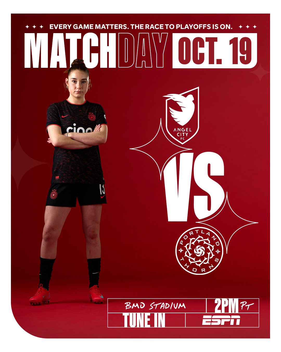
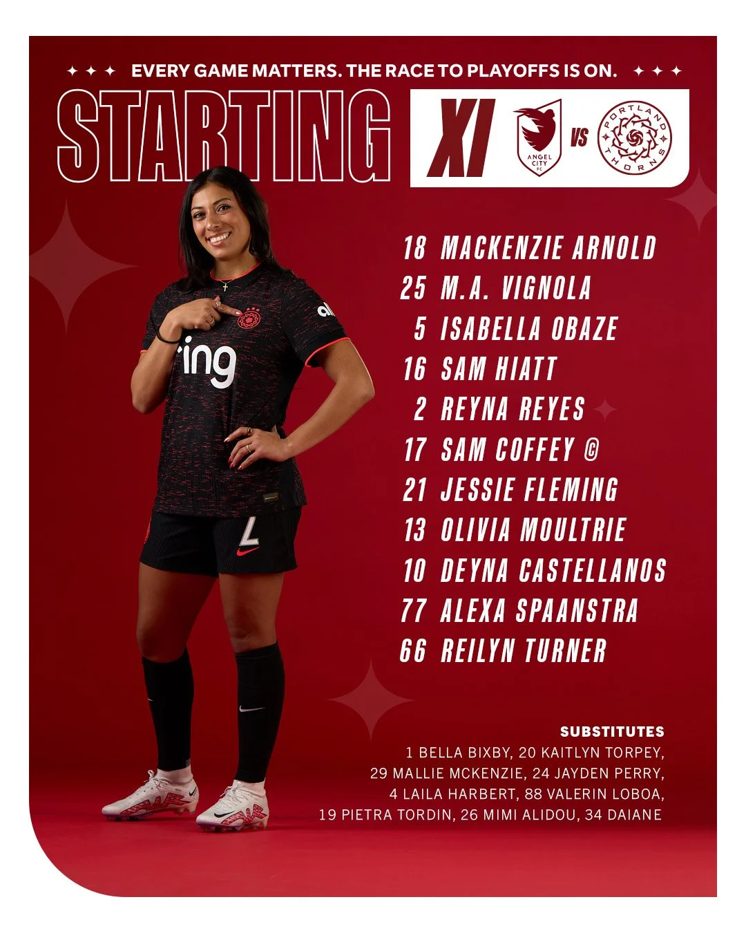
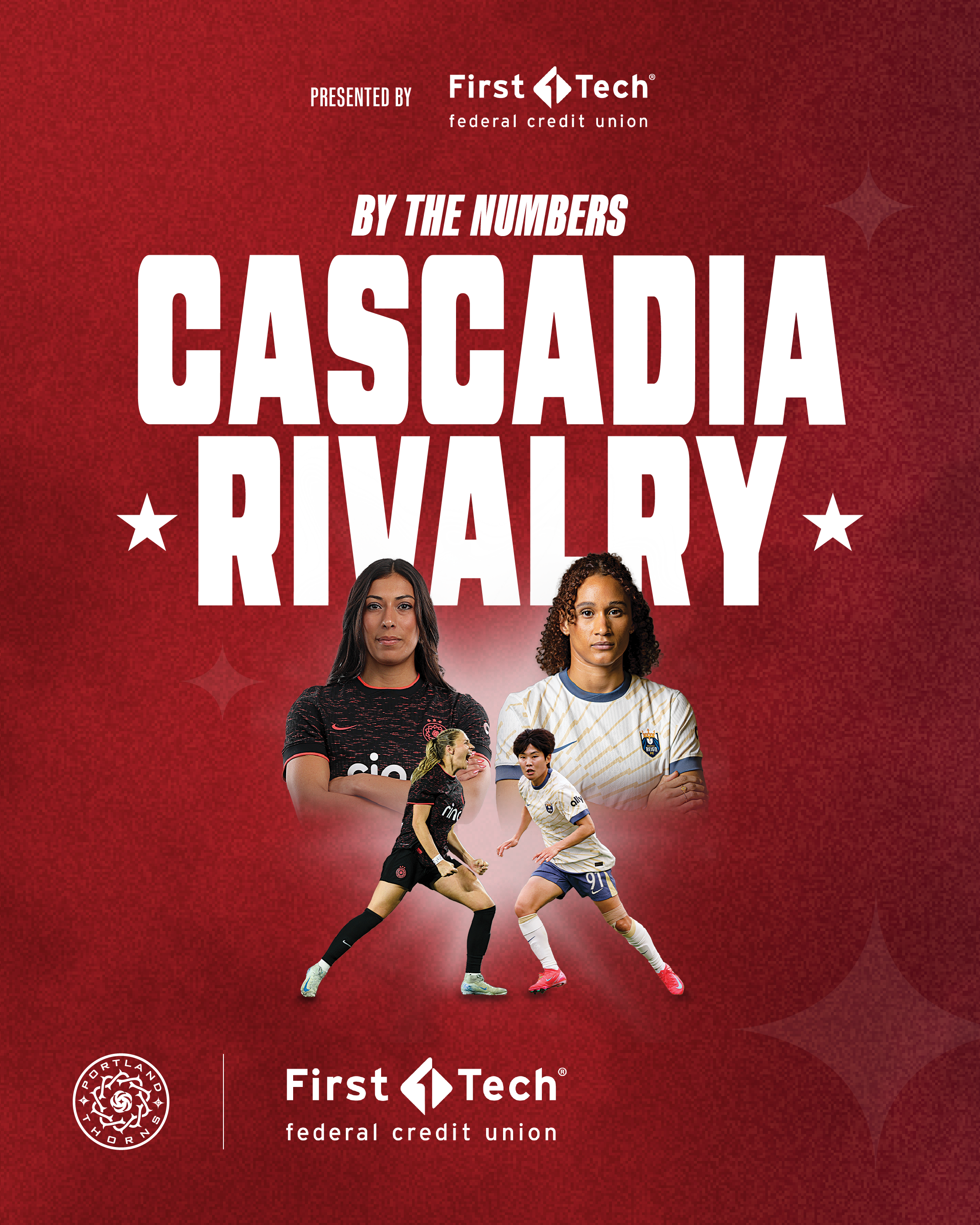
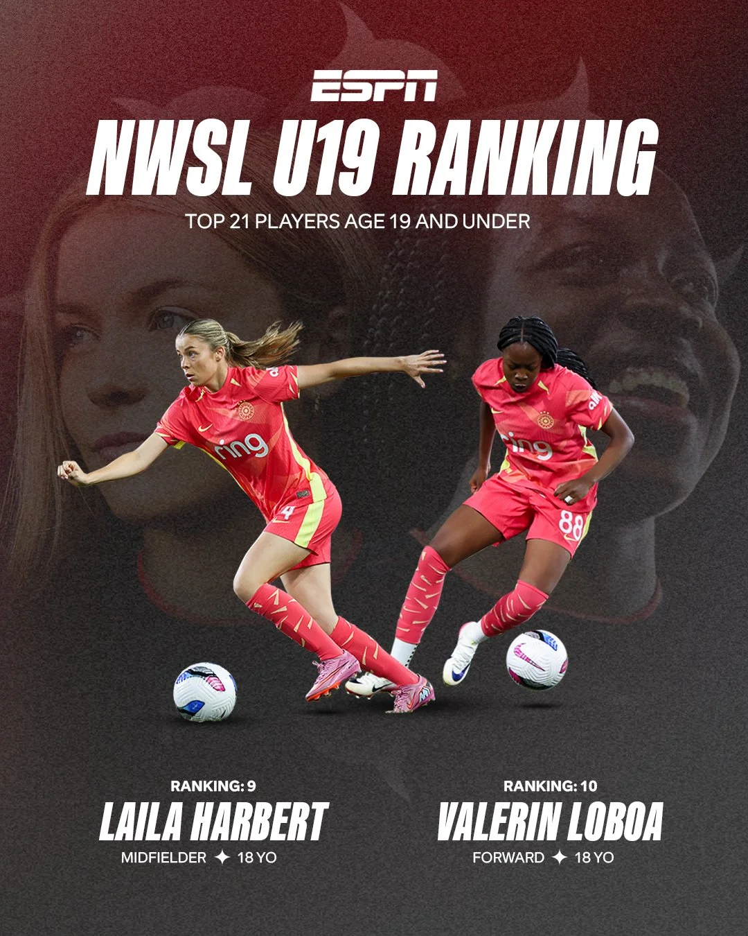
Portland Thorns 2025 Season
In the Thorns’ early stint under new ownership, our creative team set out with a clear goal: to reconnect the club with its identity by building a strong, cohesive visual foundation. We focused on distilling the brand to its purest form by removing inconsistencies and returning to the elements supporters most closely associate with the club.
This meant reestablishing red and black as our defining colors, and applying them consistently across every touchpoint. Additionally, we drew and incorporated elements from the club’s crest as a unifying visual thread. We also introduced Kaneda Black as our primary typeface, giving the club a clear, consistent voice across both internal and external communications.
Made at Portland Thorns
Creative Direction: Eric Anthony
Graphic Design: Diego Gutierrez, Tess Peppis